


Jersey Madness Monday Part 2
By Richard Gonzalez
A team’s jersey is something unique and very special. This goes a lot more for hockey and its fans, who have such a special connection to their team’s jersey. I posted an article about concept jerseys created by various graphic artists, and it got plenty of responses by fans. It even inspired Ronald Wray of Rival Hockey Jerseys (IG: @rival_hockey_jerseys) to create a fresh bunch to throw into the discussions.
Below we will feature all of Ronald’s Anaheim designs plus a few other ones we found floating online.
Ronald Wray’s Designs
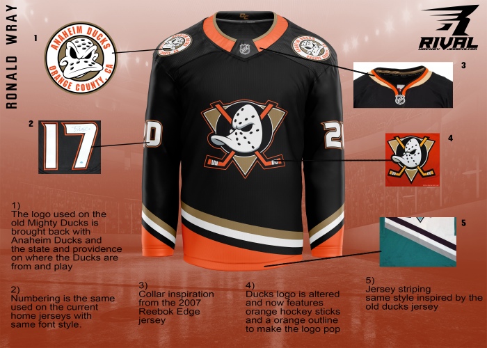
1. The first thing that sticks out about this is the shoulder patches. That Duck logo is really unique and shows some serious attitude. I like it a lot and wish it were utilized a lot more than they have been. I am traditionally not too big of a fan of green but this one is not bad. The color mixture compliments it a lot better.

2. This is somewhat similar to the Ducks third jersey now with some changes that ultimately make it better. I like the added black to the shoulder with the white and tan color strips that transition to the main part of the jersey. I also like the new striping Ronald uses at the bottom and at the lower sleeves. I wish there was a little more black but overall this looks like a complete fresh jersey unlike the current third ones that have an incomplete feel to them.

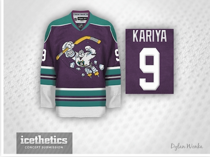
3. One of my favorite Ducks jersey was the Mighty Ducks third jersey they used for the 2005-06 season. I like the similar font used in the first image. That and the Mighty Ducks patch on the shoulder really stand out to me. Obviously, the mostly black color jersey sits extremely well with me. I do wish there was the little font above “Anaheim.” That writing of “Anaheim Ducks” is something subtle but is probably my favorite part of this design.
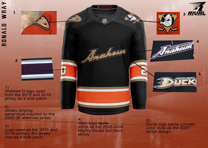
4. This design is the same besides the one obvious change on the shoulder patches. This is something I really like and it brings more of that prior third jersey back to life in more of an updated way.
5. This is one of the rare exceptions that I prefer the orange color over the black one on this jersey. It works really well with everything added. I absolutely love what is going on inside the collar. That alternate logo that I discussed before is pretty cool.

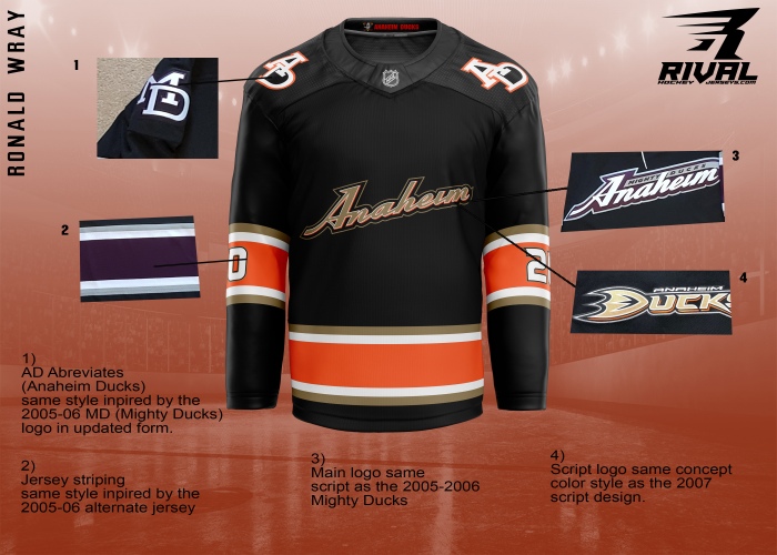
6. The same concept but with the added “AD.” Keep that original alternate Duck and boom, this one would be ranked as one if my favorites.

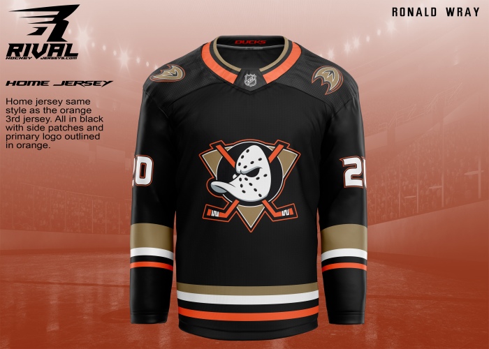
7. I always thought this logo looks a lot better on a darker colored jersey rather than an orange concept. Look how clean the 25th-anniversary jersey looked. This nails it completely. I still am not a fan of bottom striping used in the original and also the orange outline.
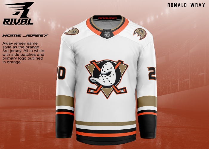
8. However, the orange outlining on this white version of this really makes it pop a lot more. I like this current version. This would be a solid way to add two types of third jerseys for the Ducks to wear. This would make up for the atrocious Nike home and away alternates.
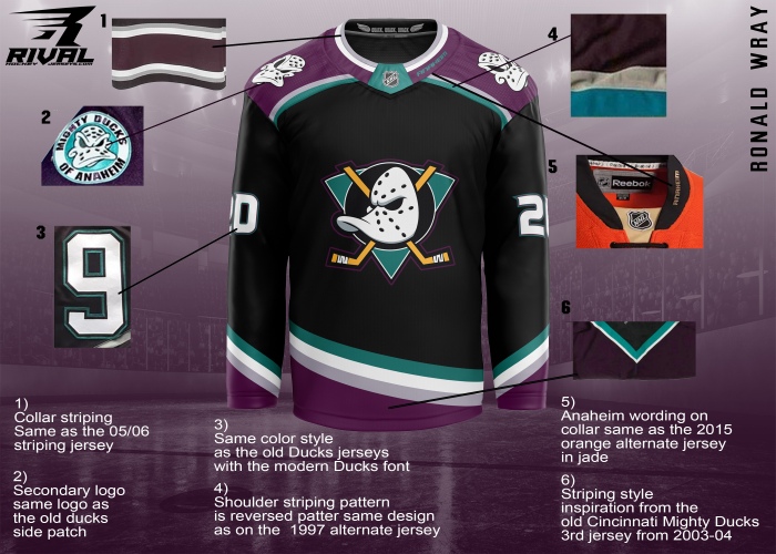
9. This jersey design is really slick and has every element I want in a jersey. The shoulder patches are beautifully placed and the alternate Duck is finally utilized as mentioned previously. The orange outline on the logo is something I do not care for too much but this hits the mark. Also, I love the “OC” inside the collar.
10. This one is my favorite out of all these designs. This has everything I want in a jersey and is something I would not think twice about throwing my money at. The color scheme is perfect. It brings back that old school look that fans have been wanting and also has some new school flare. The multiple quacks pay tribute to the movie who brought this team to life and the “Anaheim” on the collar fits in smoothly. Also, the shoulder patches are a huge plus.
Other Jersey Designs
11. This designs brings another new-school kind of design with the old-school logo. This jersey is nicely done but I still do not like the striping at the bottom. Everything else really flows nicely and also like the “EST. 1993” inside the collar.
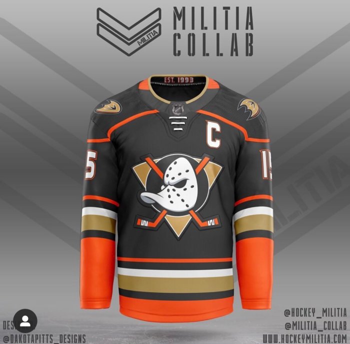
@Dakotapitta_designs @Hockey_Militia & @Militia_Collab
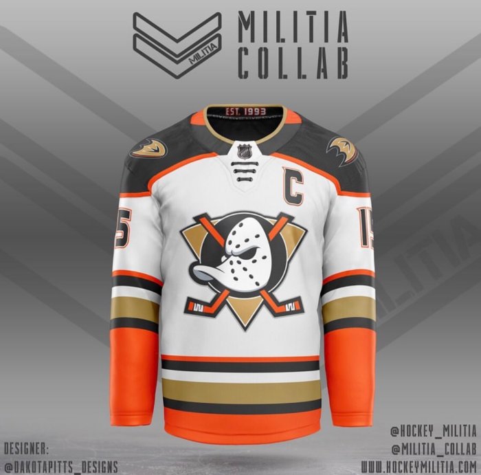
@Dakotapitta_designs @Hockey_Militia & @Militia_Collab
By: Dylan Wonka, Posted on Icethetics

Template/applied layers drawn by Ryan Haslett, Hockeyjerseyconcepts.com
15. I really like who outside the box this design is. I can’t see the team re-branding anytime soon but this is worth a look. This one is a really cool concept.
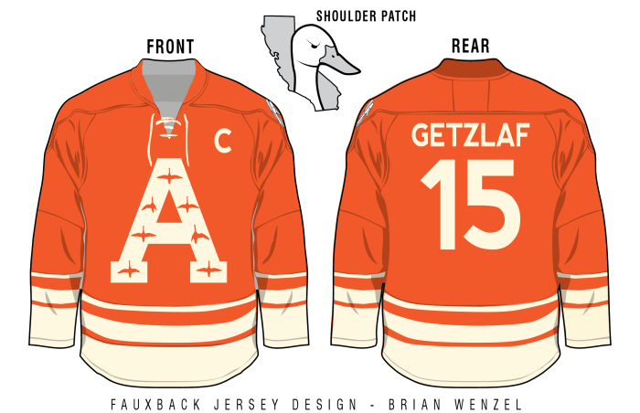
Fauxback Jersey Design/Brian Wenzel

By: @Willettdesigns Posted by Hall Fame
By: Matt G., Posted by Jerseynerdpodcast.com
By mthockeyjerseys
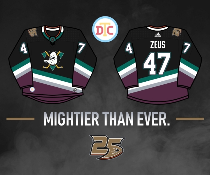
By: DTConcepts
There is a lot of great work done here. I can see some potential that fans can go crazy over. I want to give Ronald another shout out because he decided to create all new concepts after we posted our first set. His dedication to his work really shows.
Also, we’re planning to put all these concept jerseys together and create a fan vote elimination challenge between all of them to see which ones fans like the best. Stay tuned.
In the meantime, which one(s) is/are your favorite? Leave a comment below.
Related Article:
Jersey Madness Monday (Part 1)
For more Anaheim Ducks concept jersey design discussion listen to our hockey podcast by clicking below or visiting us at Podomatic, Spreaker, or YouTube.
Statement From DucksNPucks
This event is bigger than the Anaheim Ducks and sport of hockey. It affects the entire sports industry and the world as a whole. Our sympathies and concerns go out to anyone affected by this worldwide incident. This will be a trying time for the world, but the triumph of the human spirit will get us through this.
Stay strong, stay safe, be kind, and love one another.
Support us by becoming a DucksNPucks patron! Members can win game tickets, a $200 Cool Hockey gift card, and more!
Want to start your sports media career? Then Join The Puck Network!
DucksNPucks is part of The Puck Network, which covers the entire NHL. There are openings to cover your favorite team(s) and earn school credits! If you are interested, then apply by filling out the form here: Join Our Team. What are you waiting for? Start your sports media career TODAY!
May 4th, 2020
PICK A TEAM

chigago blackhawks
Chi-Town Hawks

anaheim ducks
Ducks N Pucks
boston bruins
Bruin Strong

carolina hurricanes
Carolina Caniacs

colorado avalanche
Denver Avs

arizona coyotes
Coyotes Howl

Buffalo sabres
Sabres Den

columbus blue jackets
Blue Jacket Army

dallas stars
Shootout Stars

calgary flames
Fierce Flames

detroit red wings
Red Wings Town

new york islanders
Long island Pucks

minnesota wild
Rink Wild

edmonton oilers
Ice Oilers

florida panthers
Roaring Panthers

new york rangers
Fighting Rangers

nashville predators
Preds N Pucks

los angeles kings
LA Royalty

montreal canadiens
Hockey Habs

new jersey devils
Puck Devils

st.louis blues
Break Away Blues

san jose sharks
Bay Sharks

ottawa senators
Slap Shot Sens
philadelphia flyers
Furious Flyers

winnipeg jets
High Flying Jets

vancouver canucks
Canucks N Pucks

tampa bay lightning
Bay Bolts

pittsburgh
Pens N Pucks

toronto maple Leafs
Just Leafs

washington capitals
Capital Pucks