Returning To The Past?
By George Casner III
With the hockey season on pause, or potentially over, I’ve been rewatching plenty of Ducks games and it got me thinking, are we going to see Anaheim go back to their roots?
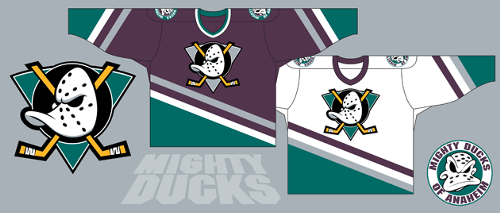
We are all familiar with the, arguably, most iconic logo in hockey, the Mighty Ducks Crest. Everything about it has become iconic. Between the duck-shaped, old school goalie mask, the crossed sticks, and the triangular back that changed colors based on the jersey it is on. Over the past few years, we have begun to see a resurgence of this logo.
Are the Ducks looking to make the original logo the primary one again? Let’s take a look.
From the day the team debuted in 1993 and up until the 2005-06 season, the Mighty Ducks crest was the main logo. Then after a rebranding in the 2006 offseason that logo vanished, completely being replaced by the wordmark which featured a duck foot inspired “D” in the word “Ducks”. The color scheme was also changed to gold, orange, black, and white.
That wordmark lasted up until 2010 by itself until the Ducks revealed their new third jersey where that Webbed D broke away from the wordmark and became the main logo by itself. But something else made an appearance, on the shoulder patches we saw the Mighty Ducks crest reappear, now sporting orange sticks and a gold triangle. Something small but a logo that had been untouched for years, with the exception of a throwback night in 2013.
In the 2013-14 season, that third jersey became the new, and current, home and away jerseys. We also saw some more merchandise baring the Mighty Ducks crest appear on the shelves at Honda Center. Then, in 2015, the orange third jersey with the recolored Mighty Ducks logo took the ice and shops by storm. That jersey quickly became a popular one among Ducks and hockey fans in general. We also saw a lot more merchandise with this logo appear.
This gained more popularity and during the 25th Anniversary Season was when we saw a mash-up jersey featuring all bits of the Ducks’ past. What was front and center on this jersey? The Mighty Ducks logo with a silver triangle and orange sticks. After this, the team returned to their orange alternates that bare the old logo.
But enough with the history, why do I believe that they will be making a return to the past?
One simple answer: money. I know, I know, the root of all evil but being honest, the original logo of theirs is the most iconic. If you took the current logo and the original logo, showed them both to a non-hockey fan, and asked them to name the team, most would not be able to figure out the Webbed D. You might get a few who know but overall it would be a lot of blank expressions. But when asked about the original logo, they’re likely to answer, “That’s the Mighty Ducks.” It is the more iconic of the two and the more iconic a logo is, the more merchandise it will sell.
The 25th Anniversary jersey was constantly selling out on the NHL’s website. That means more money for the team and the organization. Logistically speaking it makes the most sense. The number of shirts, hats, lanyards, etc. with the old logo at the Honda Center store is on par with that of the current logo. That’s a lot of dollars sitting on the shelves and it goes relatively quickly.
Listen To The DucksNPucks Podcast
But there is a second reason why I believe we will see it return: the color orange. Orange has become the Ducks’ thing since the rebranding, to the point that their playoff tagline was #PaintItOrange. Rumors even floated around for the past few years that the Ducks were going to use a new home jersey and that it would be orange. What better jersey to transition to than the current orange one they have? And assuming they do that, wouldn’t having two orange jerseys be redundant?
It would make more sense for them to transition the current third to the new home, make a white variant of it for away, and design a new third using the current Webbed D logo. Similar to what they did in the 2013-14 season with the current jerseys. The agreement between the team and the Honda Center that was signed a few years ago states that they can’t change the team’s name; they have to stay the Anaheim Ducks. But the logo is not mentioned at all.
So what do you think? Will they make the third the new home? Will they go back to their original logo in yet another color scheme? Or will Anaheim keep with the current logo?
Listen to our hockey podcast by clicking below or visit us at Podomatic, Spreaker, or YouTube.
Recent Articles:
Freeway Face-Off: Legends Edition
Statement From DucksNPucks
This event is bigger than the Anaheim Ducks and sport of hockey. It affects the entire sports industry and the world as a whole. Our sympathies and concerns go out to anyone affected by this worldwide incident. This will be a trying time for the world, but the triumph of the human spirit will get us through this.
Stay strong, stay safe, be kind, and love one another.
Support us by becoming a DucksNPucks patron! Members can win game tickets, a $200 Cool Hockey gift card, and more!
Want to start your sports media career? Then Join The Puck Network!
DucksNPucks is part of The Puck Network, which covers the entire NHL. There are openings to cover your favorite team(s) and earn school credits! If you are interested, then apply by filling out the form here: Join Our Team. What are you waiting for? Start your sports media career TODAY!
April 10th, 2020


